We gave the Adventure Lab® app details screens a makeover, just in time for the holidays. We improved usability and added new handy information such as time to complete, a progress bar, and numbered stage pins for sequential Adventures. See what’s new in our side-by-side comparison below.
Details screen polish
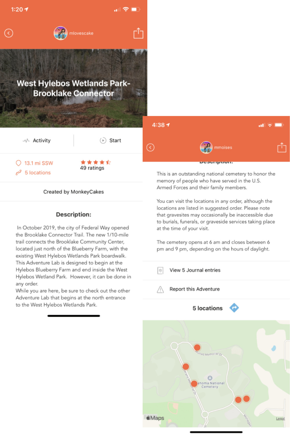
OLD
Players reported they had trouble knowing how and where to start the game.
The map with the Adventure Locations is far down on the screen.
It is difficult to know if an Adventure is sequential, which means Locations have to be visited in a specific order, or nonsequential where you can complete Locations in any order you like.
The Adventure name is over an image, making it hard to read.
It was not clear whether clicking on Activity allows players to read reviews.
NEW
Start is now displayed prominently and always visible. It moves with you as you scroll up or down.
It is clearly visible if the Adventure is sequential or nonsequential. It is displayed behind the number of Locations and on the map where Locations for sequential Adventures are numbered.
A progress bar and checkmarks on answered Locations make it easy to see what you have accomplished and how much Adventure you still have ahead of you.
It is easy to find reviews other players left before deciding which Adventure to pick.
Quickly see the estimated time it takes to complete an Adventure on the details page.
Location map overhaul
OLD
Players had trouble knowing which Location they could or should navigate to first since it was hard to distinguish sequential and nonsequential Adventures.
Location pins that were further away or inaccessible were transparent, making them harder to see.
The numbers showing progress in the blue bar on top of the map were small and hard to read.
NEW
All Locations are now displayed in full color.
Locations for sequential Adventures are numbered, ensuring it is clear in which order they can be accessed.
The progress bar on top of the screen visually displays what stage you are at in the Adventure.
Coming soon: swipe through visible Locations to preview them before you plan your route.
Location details screen improvements
OLD
Depending on your proximity to a Location to answer the question, the words Get closer or Answer on the header image were hard to find and see.
Once you have answered the question correctly, the word Completed is again hidden in the picture above the Location description.
NEW
The Answer button is now accessible and easily visible. Help text guides players closer to the Location until the button is unlocked.
Completed is moved off the image and displayed with the same importance as the View journal link.
Celebration screen(s) declutter
OLD
Completing an Adventure Location is definitely cause for celebration. But is it two screens worth of celebration?
NEW
We think that moments of joy can be easily contained within one screen, streamlining the process, and allowing you to experience even more Adventures in less time.